
ROLE
INDUSTRY
TIMELINE
TEAM
Introduction
The average Nigerian lacks access to personal finance, investment, and wealth management services. Traditional financial institutions make the investment process tedious and uncertain, convincing individuals to take risks, especially with mutual funds, is therefore challenging. In this digital age, investment has transitioned to a more accessible format, offering diverse options with minimal capital.
Problem
A large percentage of existing users on Cowrywise, particularly among the target audience of tech-savvy young and middle-aged Nigerians, are not actively investing in mutual funds on the Cowrywise app.
Goal
Increase Mutual Fund Participation from existing users.
Simplify the user experience of the mutual funds flow making it intuitive. and easy to understand.
Enhance Financial Literacy to educate users on the benefits and risks of mutual funds.
Product - Cowrywise
Cowrywise is a personal finance platform that automates your savings and. investment, taking away the stress and planning required to do such on a regular basis.

Research
I conducted 3 rounds of research, for the initial research phase, a thorough audit was conducted both independently and with remote participants via video calls to assess knowledge of Cowrywise, particularly the investment feature, and to identify areas for improvement.
The research with participants highlighted that Cowrywise is widely appreciated as a preferred platform for savings, attributed to its transparency, excellent design, and commendable customer service.
However, it was revealed that a significant number of users tended to avoid the investment section, particularly the Mutual Funds Investment feature, some users would only go there out of curiosity but no action whatsoever was taken towards actually investing in one of the funds. Even with the presence of an onboarding flow, users still found it difficult to understand.

Notes from interviews
Notes from interviews
User Personas
I tailored my user personas to the tech savvy young and middle age Nigeria who are already users on Cowrywise using the saving feature.
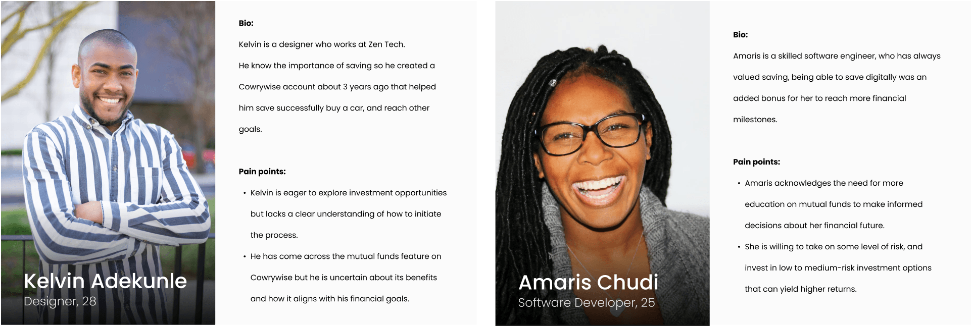
User Personas
Hypothesis
I generated a list of hypotheses that my final solution should solve for.
If we adjust the tone and rephrase statements on the onboarding screens could that enhance users' comprehension of Mutual Funds?
If we introduce concise video content with the Cowrywise mascot explaining Mutual Funds, could that improve user understanding?
Will users be willing to consume this video content for that short period of time, or would animated images work better?
Using videos would also mean optimising these videos for quick loading on smaller devices to enhance user experience, would this be a feasible solution?
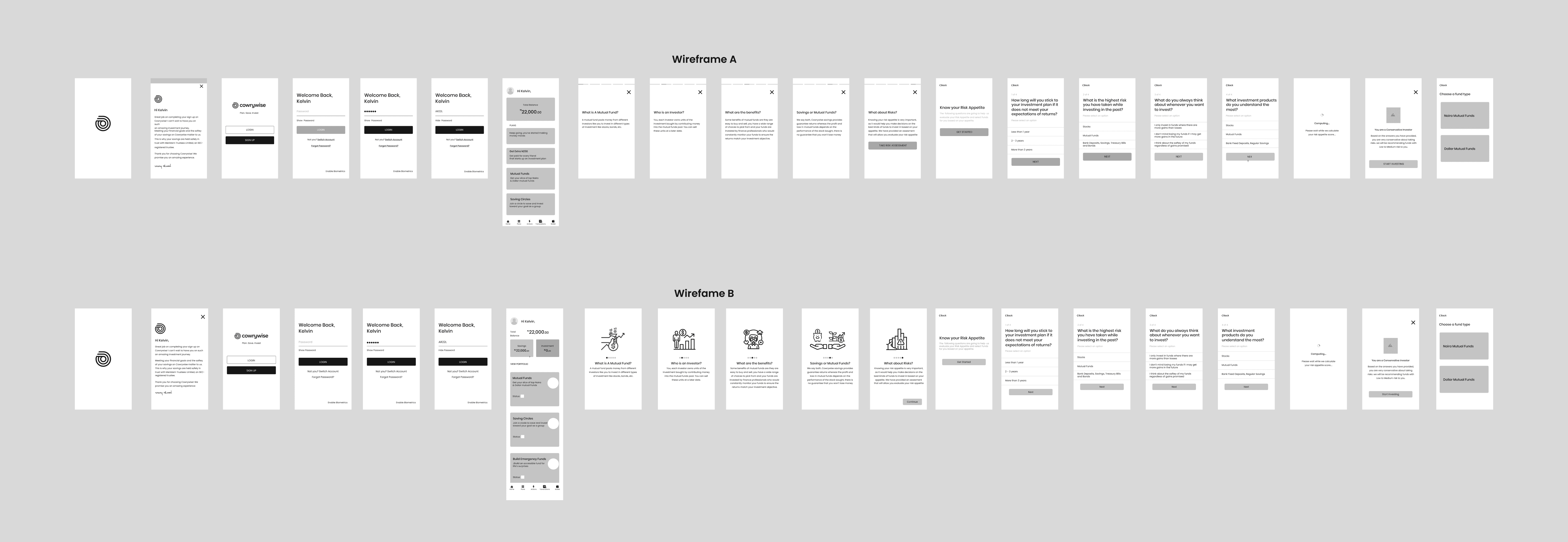
Wireframes - Low Fidelity
I created two distinct sets of wireframes based on initial sketches. These wireframes feature a redesigned dashboard placing investments prominently at the top. Additionally, I designed an investment onboarding section that explains Mutual Funds in two formats: one with content only and the other combining images with content.
Research 2 & High Fidelity
I conducted another round of research, presenting participants with prototypes of my wireframes. They interacted with the prototypes while I observed, and we subsequently discussed their feedback. The conversation covered their thoughts on the new process, what aspects they liked, areas for improvement, elements they disliked, and their preferences among the wireframe prototypes. Incorporating insights from this user research, I elevated the designs from low fidelity to high fidelity.
For both the content and image flow options, I transitioned them to high fidelity. In the image flow, I introduced changes in color for the investment section of Cowrywise. The selection of the color green aimed to evoke a sense of growth and create a distinct environment for users within the investment section. Additionally, I redesigned the dashboard to prominently feature the investment component.
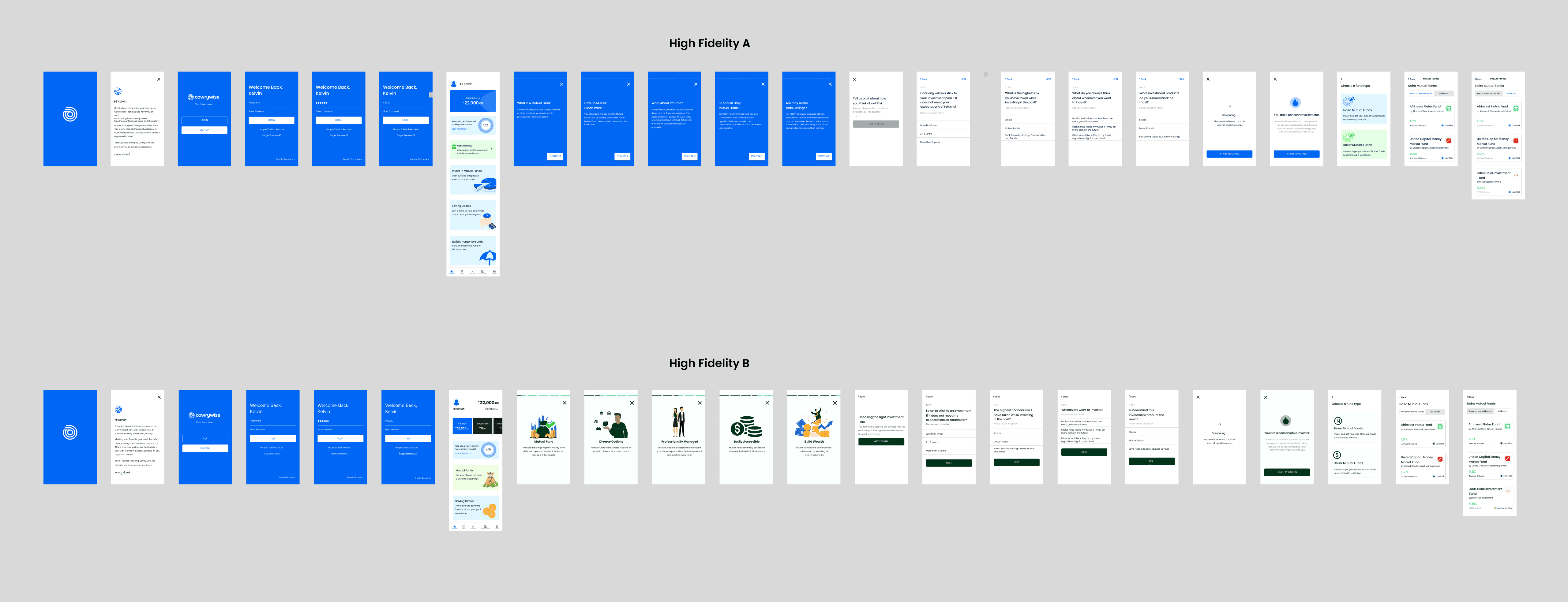
High Fidelity Designs
Solution - Ope Of Cowrywise
I shared my high-fidelity designs with participants again, and a consistent feedback emerged—I needed to further simplify the explanation of Mutual Funds for better user understanding. In the pursuit of breaking down the concept more effectively, I considered leveraging Ope, Cowrywise's hidden mascot.
Ope is a familiar figure known to all Cowrywise users. From sending emails and reminders to celebrating milestones, Ope is a constant presence in users' savings and investment journeys. The interactions and banter between Ope and users on social media resonates with many. Given this strong connection, I contemplated the idea of having Ope explain Mutual Funds using real-life examples to make the concept more relatable.

Final Designs & Prototype
The final designs represent a user-centric evolution, incorporating insights from multiple rounds of research and iterative improvements. The high-fidelity prototypes feature a redesigned dashboard with a prominent investment section, providing users with easy access to their investment portfolio.
To enhance user comprehension of Mutual Funds, I introduced Ope, Cowrywise's beloved mascot, as a guide. Ope now takes on the role of an engaging educator, simplifying the concept of Mutual Funds through relatable real-life examples. This addition leverages the existing rapport users have with Ope, fostering a deeper understanding of investment options.
While maintaining brand consistency, I reverted to the signature blue color in the investment section, aligning with Cowrywise's established brand identity.
These final designs reflect not only a visual refinement but also a strategic approach to user education, ensuring that the Cowrywise platform remains intuitive, accessible, and supportive throughout the financial planning process. Click here to view Prototype.
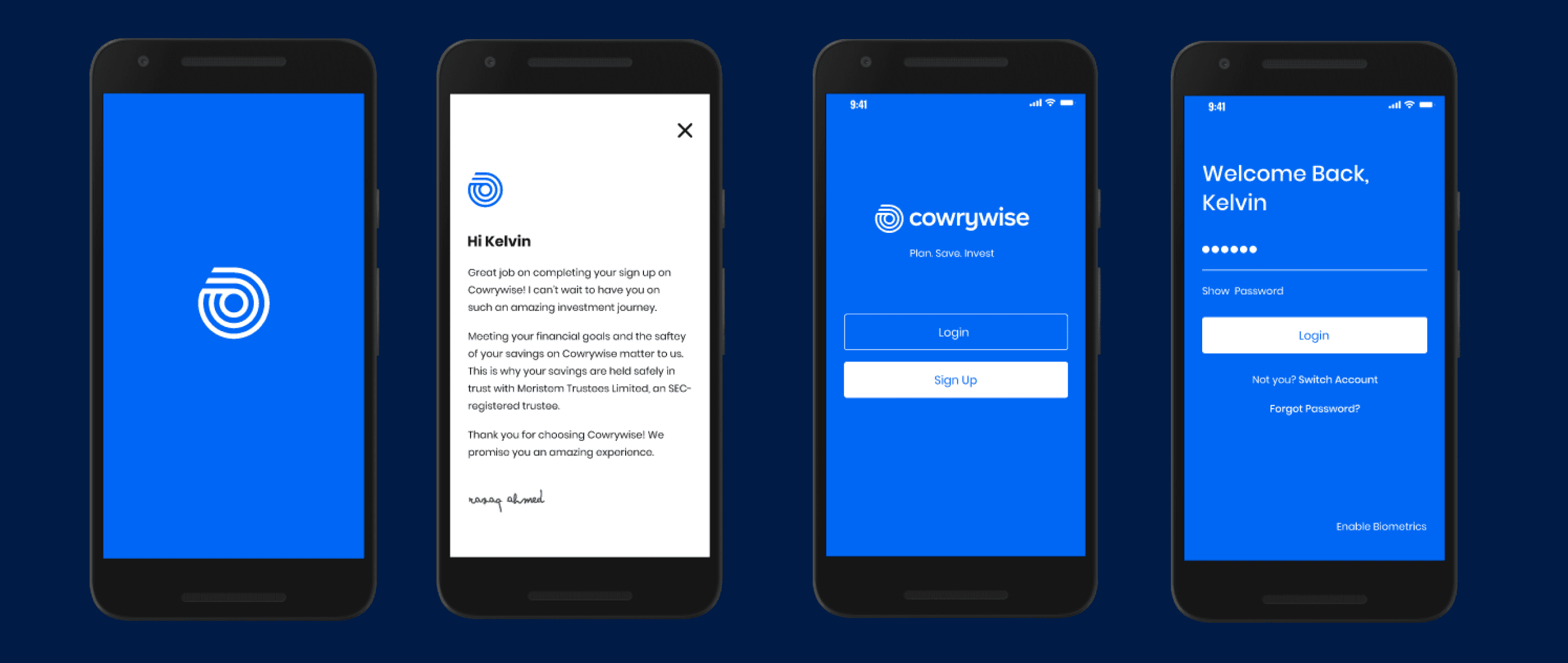
App Welcome and Login

Newly designed dashboard to include investment
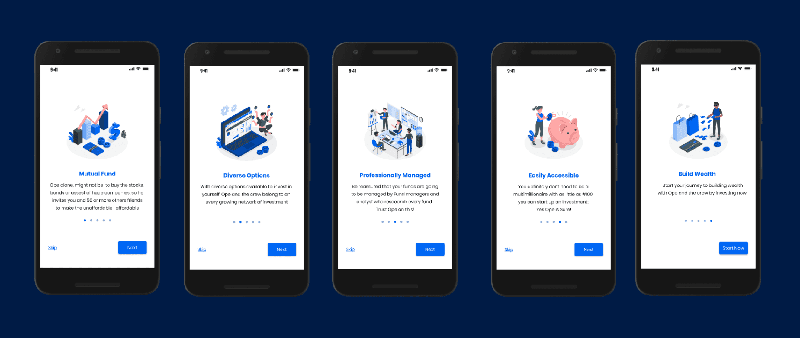
Mutual Funds onboarding screens featuring Ope

Questions to help users determine their risk appetite with Ope’s help

Based on user answers, funds with their risk appetite are made available first
Outcome
The updates made to the Cowrywise's platform empowered users with enhanced financial confidence and understanding. The incorporation of Ope, the beloved mascot, as an educational guide in explaining Mutual Funds brings a personalised touch to the user experience.
Lead Designer at Cowrywise absolutely loved the ideas (Feedback)
Key Takeaways
As a designer, this project proved the importance of donning multiple hats to address diverse challenges across different projects. To effectively communicate financial concepts to users, I had to learn accounting terms and the fundamentals of mutual funds, this helped me to create coherent and user-friendly designs.
Additionally, bridging the gap between complex financial jargon and user-friendly communication using familiar elements from the users' perspectives, helped to further enhance users' financial education.